

How a brand is created?
We like to see the beautiful works of our colleagues from around the world, to get inspiration of them, to seek the solutions of different tasks, to analyze the new tendentions, to meet the new cultures, sometimes so foreign for us. The results of the most of the works are looking so perfect that we don't often reflect on how the author's path in creating the given design was difficult and full of adventures. In this project I’d try to describe all the stages of work for you to get an authentic view on this fascinating job which the package designer is. Okay, let's go.
Introduction.
I've communicated via the Behance platform with an employer from Eastern Africa who owns coffee plantations in Zimbabwe, Rwanda, and Burundi. He talked about unique and environmentally sound production, which has been grown feral without using chemicals. The brand is named Mantis Coffee in honor of mantises which are the predator insects fighting against pests. Due to the unique natural protection, the company entirely excluded the use of dangerous pesticides. The brand's problem was the unattractive package design that didn't reflect the uniqueness, exclusivity, and sustainability of the product in any way.
The beginning of the project.
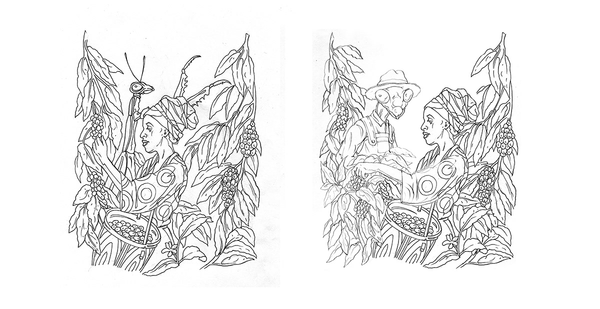
I proposed to depict a mantis on the package, to make him the face of the brand and moreover to picture the team-work of the farmers and mantises to improve the attractiveness. The main objectives were that the illustration itself provokes interest in consumer and makes him to pick up the product. It was assumed to print on the reverse side of the package the brand's story and the illustration meaning. The client got inspired and the work has begun. It was really hard to depict the insect and the human together, there was no united view in the object's proportions. Nevertheless, I was able to complete the idea till the final subject in a short term. It seemed I finished the project, I was clearly seeing the final outcome. I wasted no time made the initial sketches of the rest two images just in a day.


Black Tuesday.
There were no signs of trouble. In the mail sent on Tuesday, the client expressed doubt about the mantis' look. In his opinion, the mantis looked too aggressive, his looking, and the clutches position - all of this made a dubious scene. It seemed the insect attacks the human. The client asked to abandon the demonstrating of mantis because in any way the insect would look aggressively. That shocked me and meant to start from scratch. I had no time or interest to try convincing the client. Eventually his speech was an opinion of a consumer and if he is right, my illustration could harm the brand itself.

Eureka!
I have googled maybe someone used the mantis as a mascot before. Time was flowing, nothing was found, and my inspiration had nothing to stick. I thought the project is about to collapse so I had to refuse to work any longer. In the evening, I had to watch a cartoon with my daughter about fairy animals then I saw a cat in farmer clothing and it struck me: what if I draw a mantis in human clothes so it looks like a farmer? The same evening I take up the pencil and paper. I make a new sketch immediately and proceed to the final drawing. Without further comment, I attach the image to the mail and send it to the client at 4 AM, after that I go to bed very exhausted. When I woke up, I already had good news: the project is confirmed! A lot of time is spent I draw the rest without losing the rhythm, nevermind I will enjoy afterwards!
The logo.
All the while, I work hard on the logo. I had two ways: the first, a logo based on standard fonts, and the second a completely hand-drawn logotype. There were two finalists. The first version was based on Parkside font and the second version was a full author's work (hand-drawn). It is not hard to guess which one was my favorite but the client thought otherwise so I had to work on the first variant.
All the while, I work hard on the logo. I had two ways: the first, a logo based on standard fonts, and the second a completely hand-drawn logotype. There were two finalists. The first version was based on Parkside font and the second version was a full author's work (hand-drawn). It is not hard to guess which one was my favorite but the client thought otherwise so I had to work on the first variant.

Drawing style.
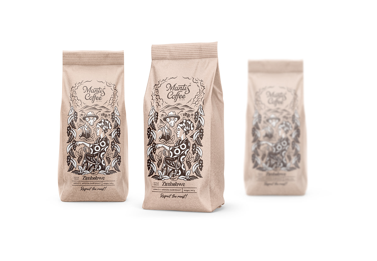
Well the illustration and the logo are confirmed. It's time to determine the drawing style because the printing technologies, the selection of material and the overall costs on the package are depending on it. We already know that the specific feature of our brand is environmental friendliness. So I suggest the client to stay on track and to choose the most eco-friendly and cheap package made of kraft paper. The second important argument is costs on printing stamps. That's why I make a monochrome image but the drawing style is my favorite vector graphics. If it were 90s, my design would easily fit on a 1.44 Mb floppy disk.

The finish line.
Placing the design on mockups.


Thank you for reading!
I hope that next time buying a product in the store you will remember my story about a difficult work packaging designer.


